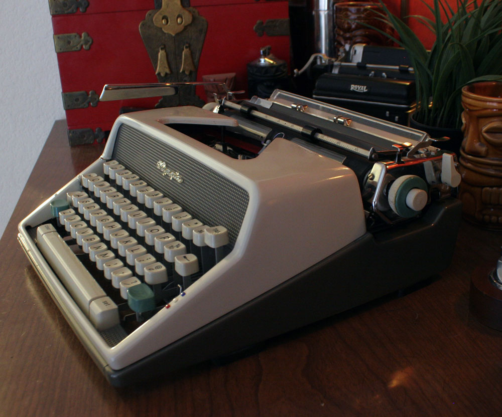
Weapon of Choice: “Cadwallader” 1963 Olympia SM7 #2335640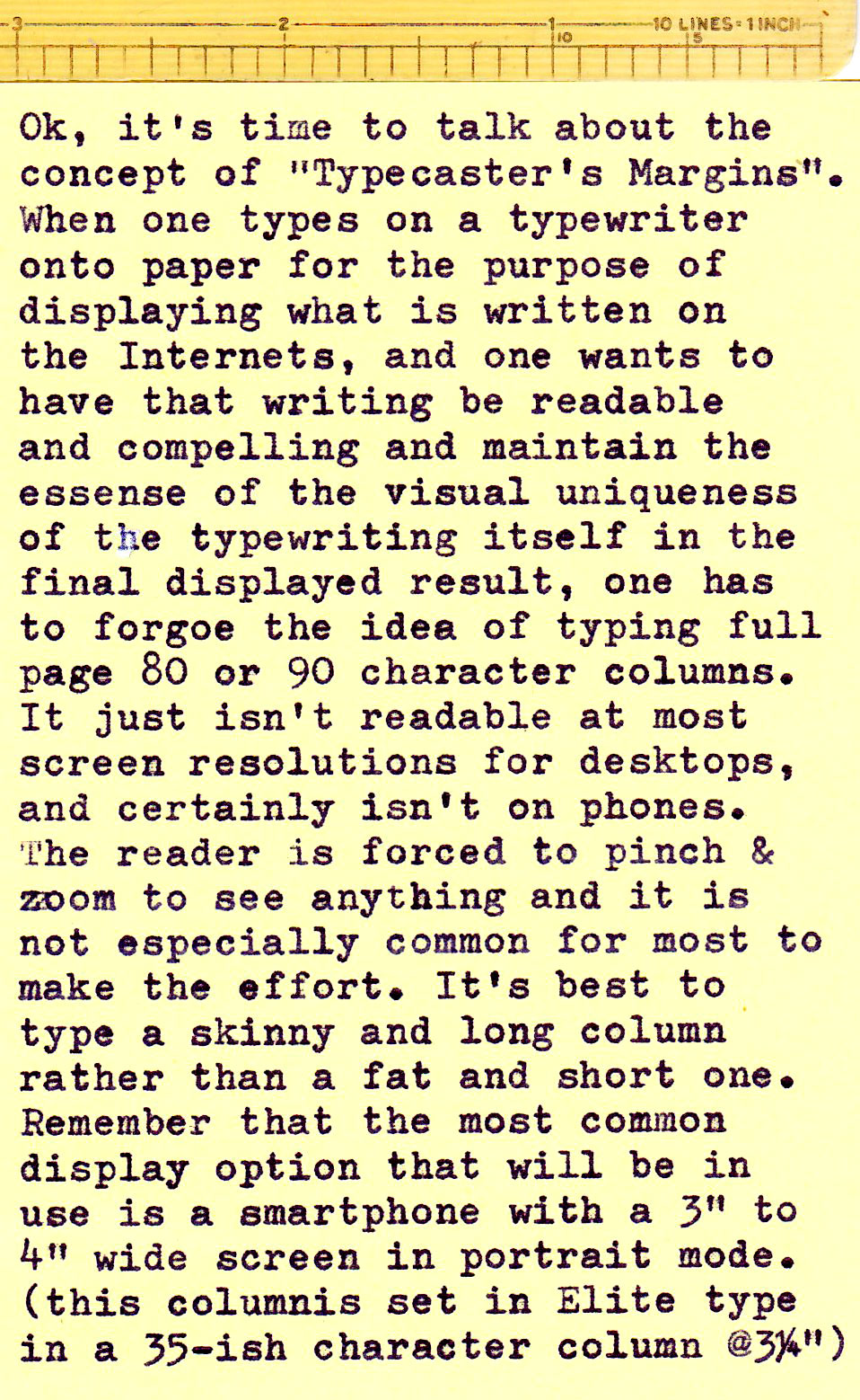
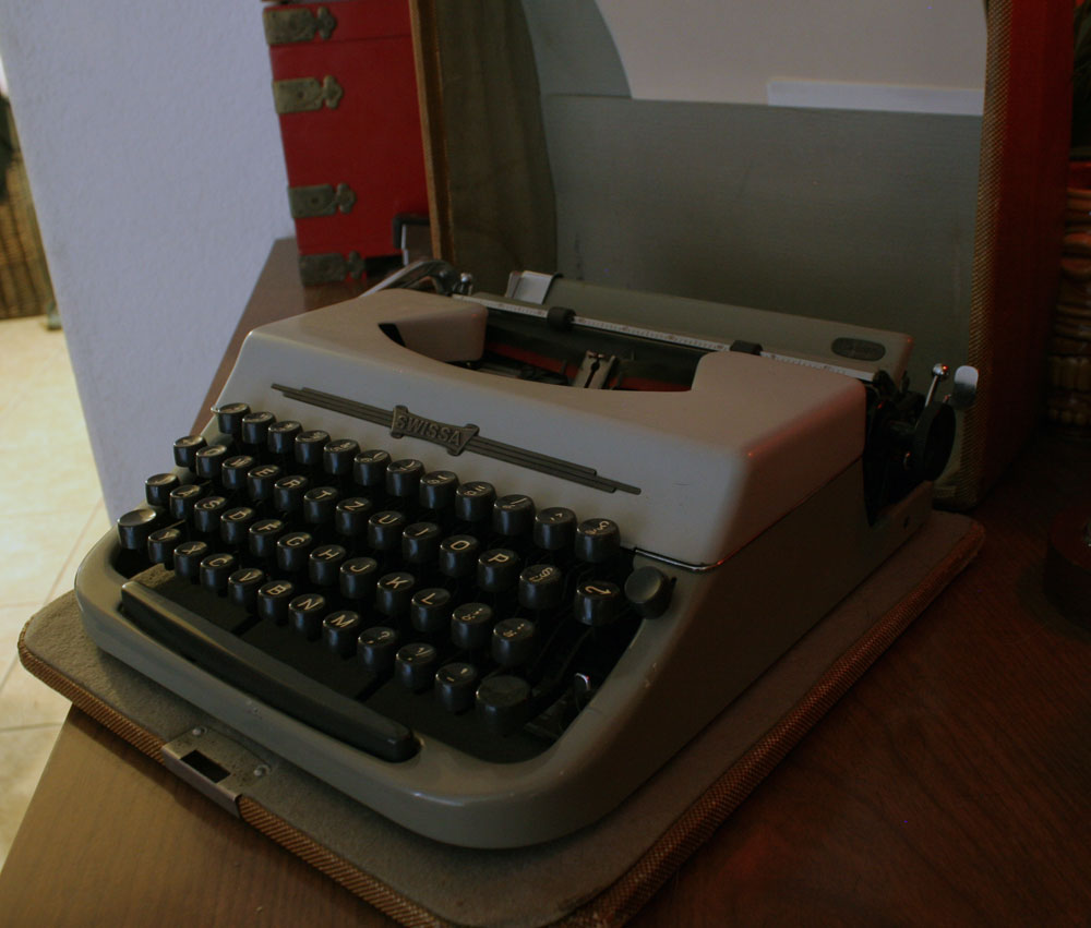
Weapon of Choice: “Adwoa” 1961 Swissa Junior #6102535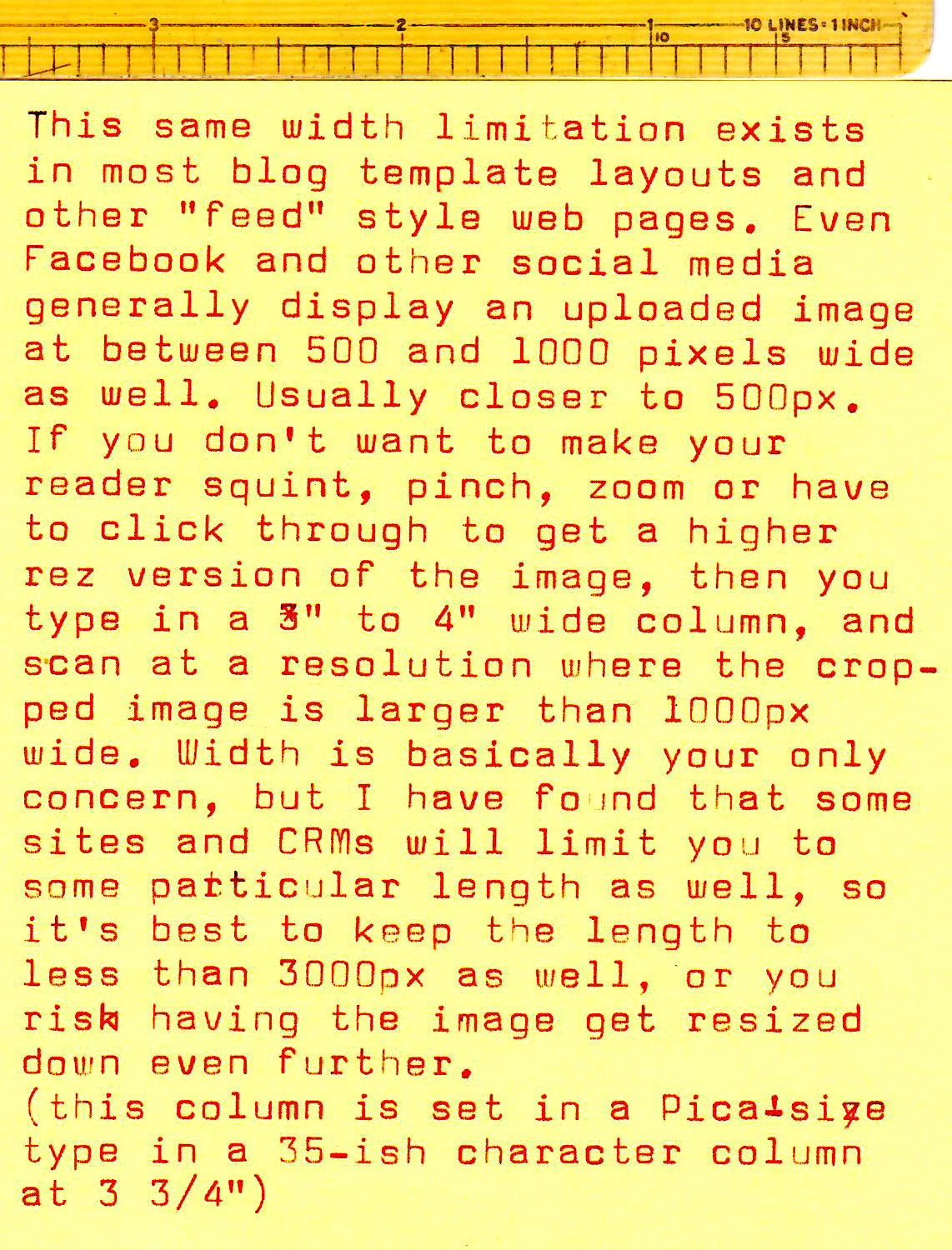
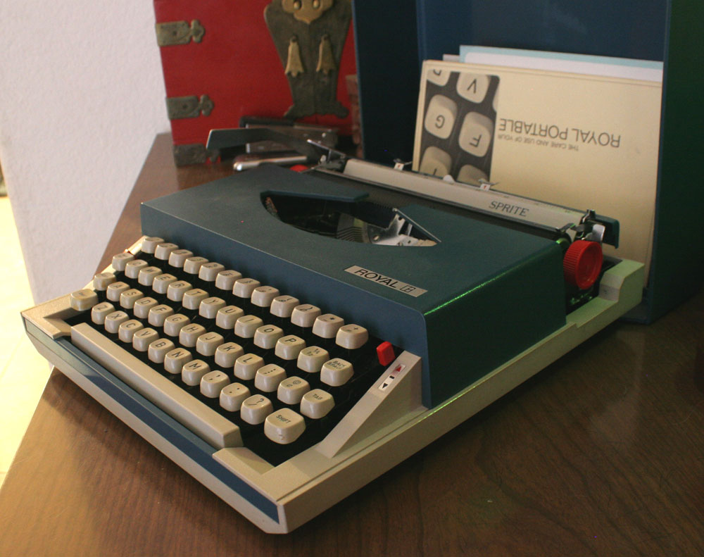
Weapon of Choice: 1971 Royal (Silver-Seiko) Sprite #NM 1113791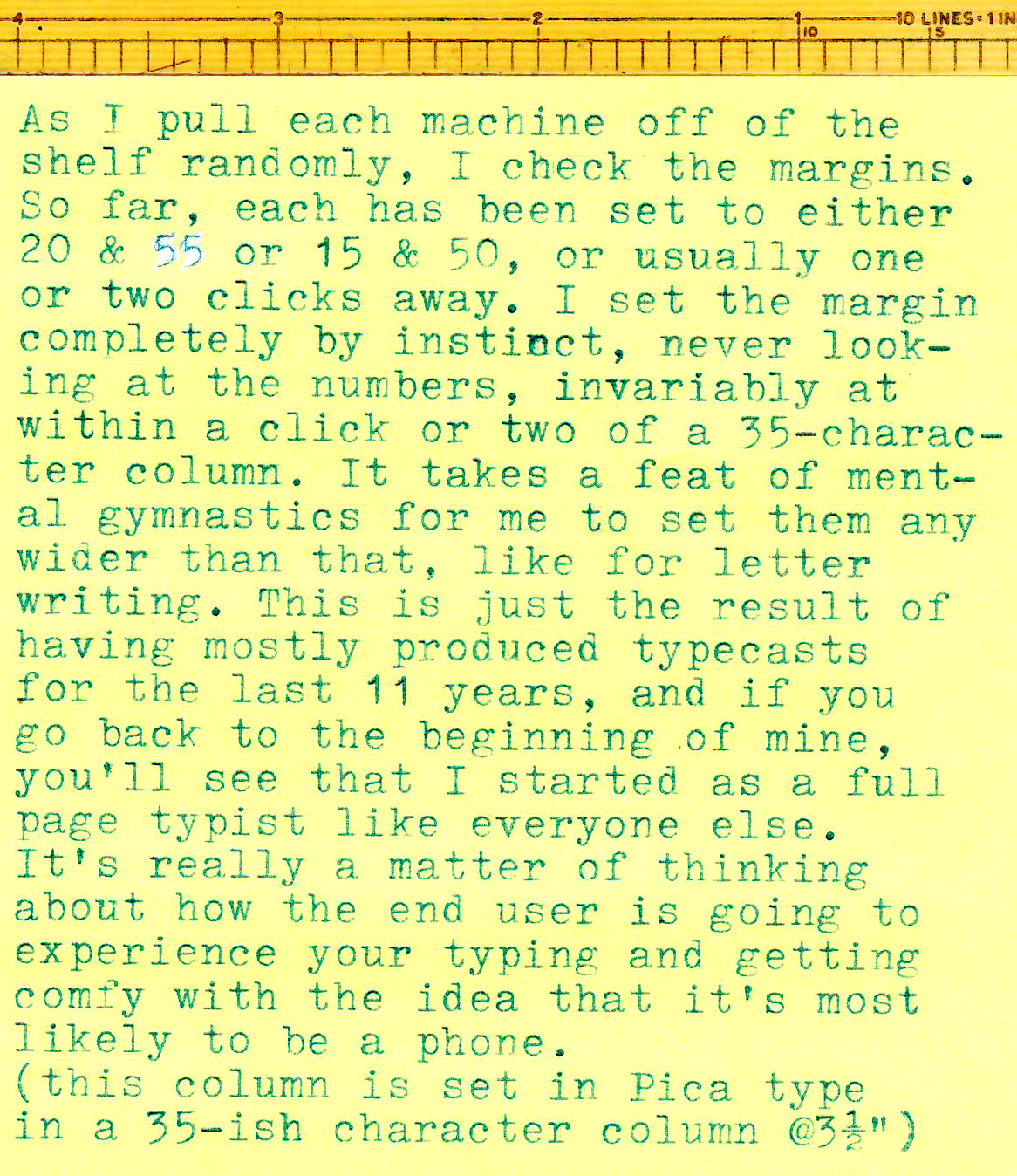
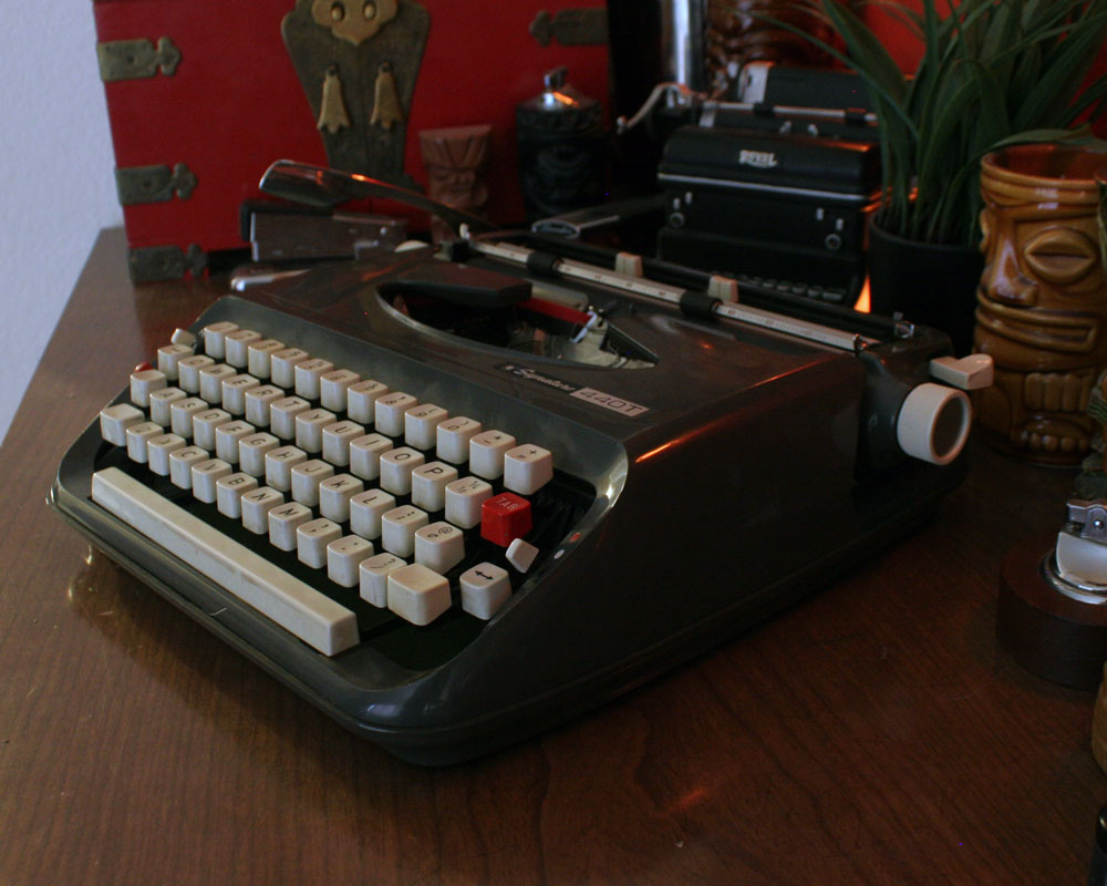
Weapon of Choice: “Thunderbird 4” 1968 Montgomery Ward Signature 440T #C8899610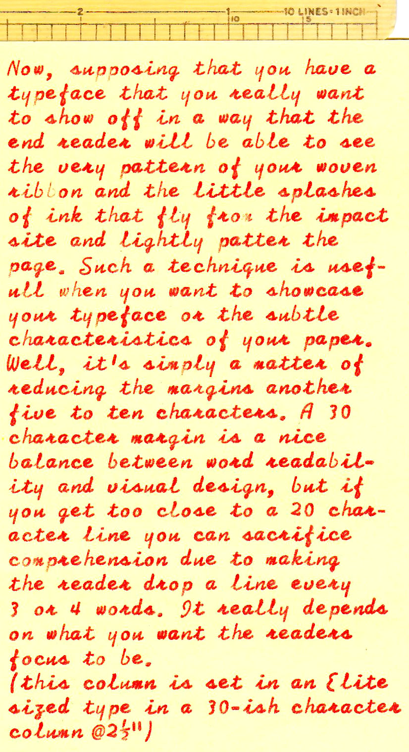
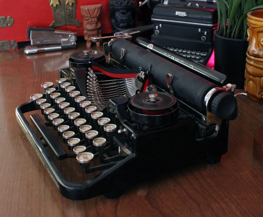
Weapon of Choice: 1925 Underwood Portable 3 Bank #147487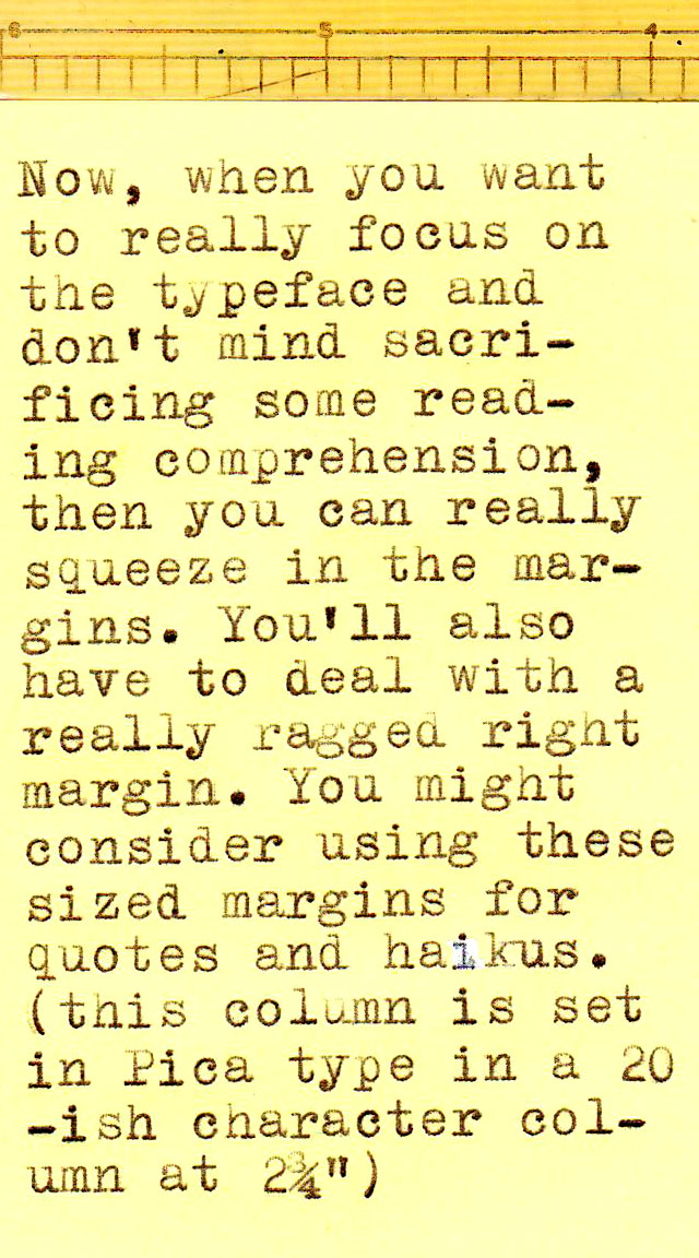
You’re exactly right. It’s fatiguing to look at a full-margin typewritten page, especially on a little phone screen, and you’ve gotta wonder how many people are going to bother. You have consistently posted the most readable typecasts around.
Nice! Maybe I’ll go for one word column widths, giant-sized letters!
I agree Ted. I generally use a full page on my blog when I’m lazy. 1/2 page width is generally best as I get margins and a nice display on a blog. Also one page is quite a lot to read. I find it easier to read a long column rather than a page width. There is a reason Newspapers used a narrow side ruled column
Cadwallader ? Not Otis Cadwallader, is it? (:
William Cadwalader from “Man’s Favorite Sport” 1964
https://www.imdb.com/title/tt0058324/
Aah – made me remember actually watching that on daytime-TV, ages ago :-)
Great advice as always! My 6-cpi typewriters are probably ok for full-page blogging, with about 40 characters per line.
So true!
I once or twice typed a letter-size page for OTP in two columns. It was easier to read but still required some zooming and moving about on the page to go from one column to the next.
I find that more space between lines is better for readability, at the cost of fitting less text on the same page.