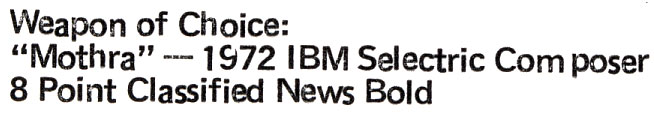

In answer to a comment below, I typed up a sample of the phrases they wanted ID’d using Mothra (my Composer) and my guess at what type balls were used.
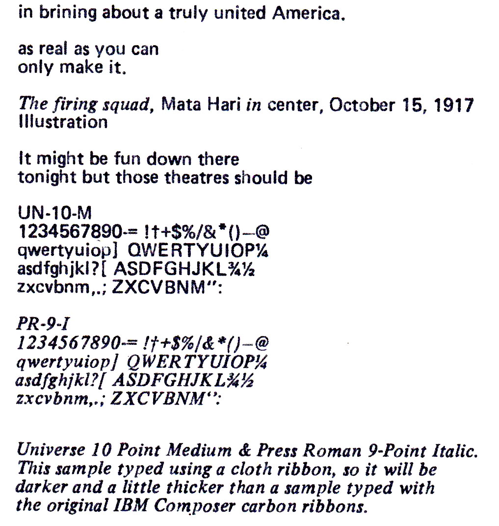
In answer to a comment below, I typed up a sample of the phrases they wanted ID’d using Mothra (my Composer) and my guess at what type balls were used.
I kind of like that misaligned bold typing. I can imagine it being used in some advertising of the ’70s.
That huge font in cattywampus mode is the best – such a nice fun-loving, summertime vibe.
It’s very close to what we used to call “Adsans” in the 60s and 70s, primarily for stop press type in about 4 3/4 point. I see it described as “A humanist sanserif shaped in 1959 for efficient use as a text face for newspaper classified ads by Walter Tracy at Linotype & Machinery.”
Oh dear Ted, I’m sorry if you had inappropriate traffic. There have been two, maybe three occasions when I have been asked about selectrics and I pointed folks to your site. I hope they searched and found rather than badgered you though. Meanwhile, the compositing’s coming along nicely!
Hope this is of some help: Lettera 22 – Glascow made: serial no. S718960.
Typeface example here: http://nathanguitars.com/2012/04/19/italian-food-design/
It would be very nice to have it digitized
Hello. I am hoping to identify the font used in a book of poetry from 1975 that I believe was typeset on an IBM Selectric Composer, and this post has been very helpful! Based on your images, I think my font may be Classified News, but I’m not certain. I just posted about this in a font-ID forum, including a sample image of my font and a link to your blog post: https://fontid.co/21617/ibm-selectric-composer-font-s-1975. I wanted to leave a comment here as well, in case you have any thoughts for. Thank you!
I have added a new image at the bottom of this post which is the sample you put up on fontid, but typed on my Composer using Univers 10-Point Medium and Press Roman 9-Point Italic. The letterforms look right to me, but you can compare & decide. These two faces “Univers” and “Press Roman” were by far the most popular fonts, if I go by how many of these balls are floating around the markets in the past 10 or so years.