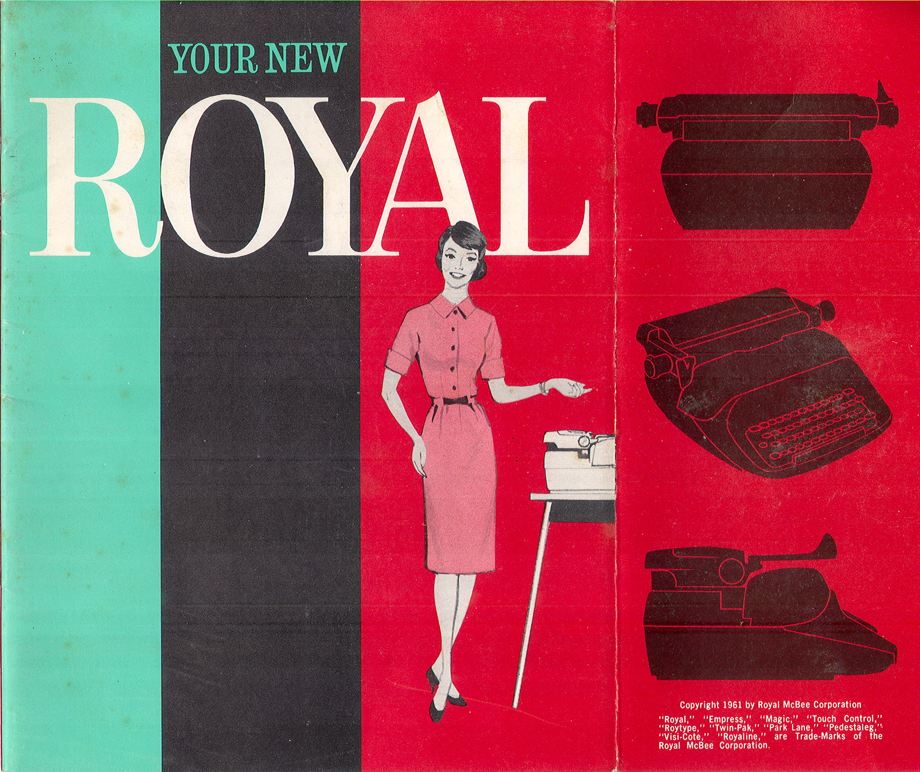
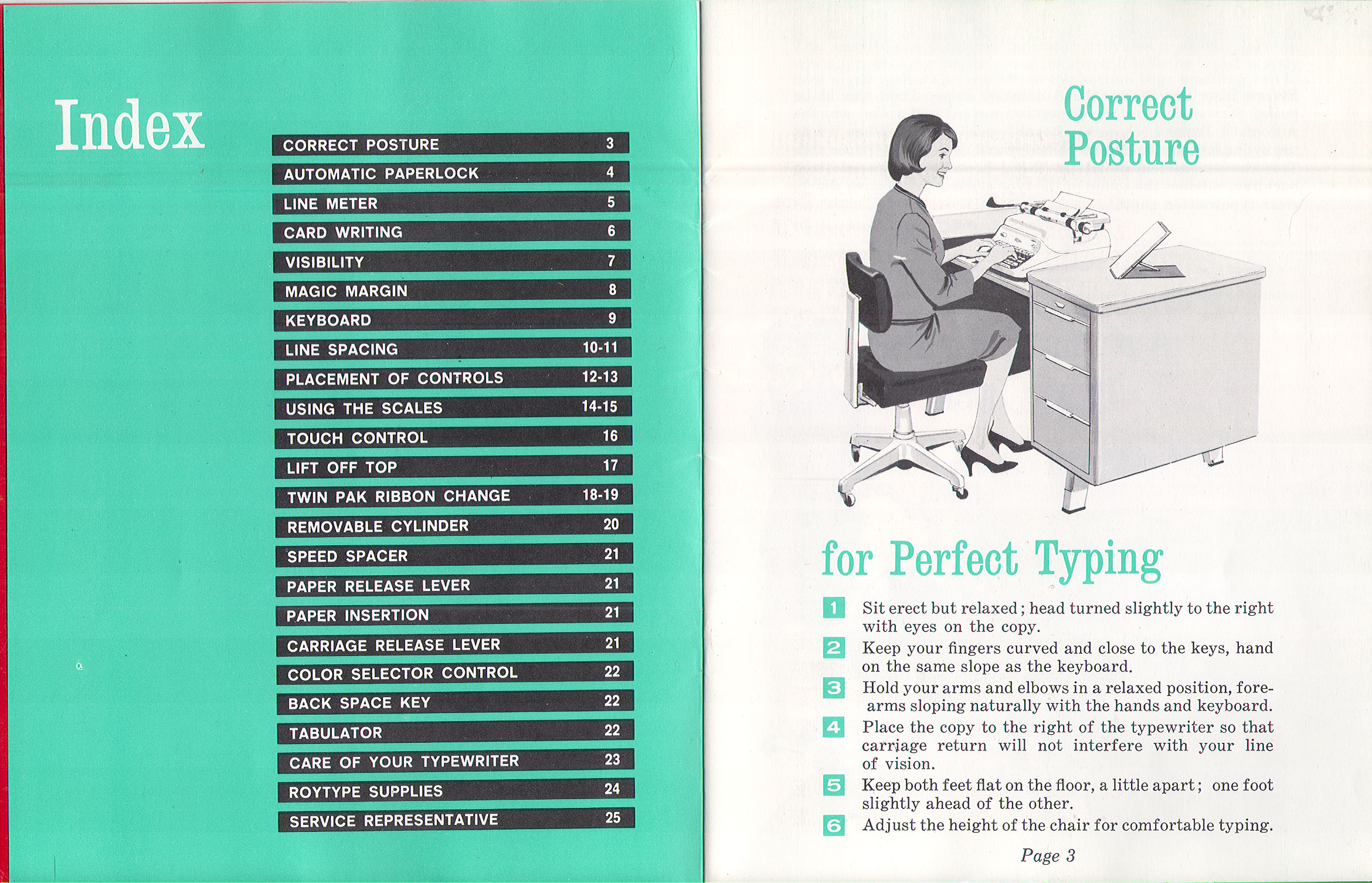
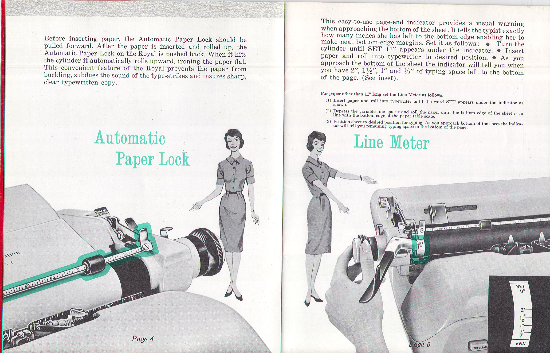
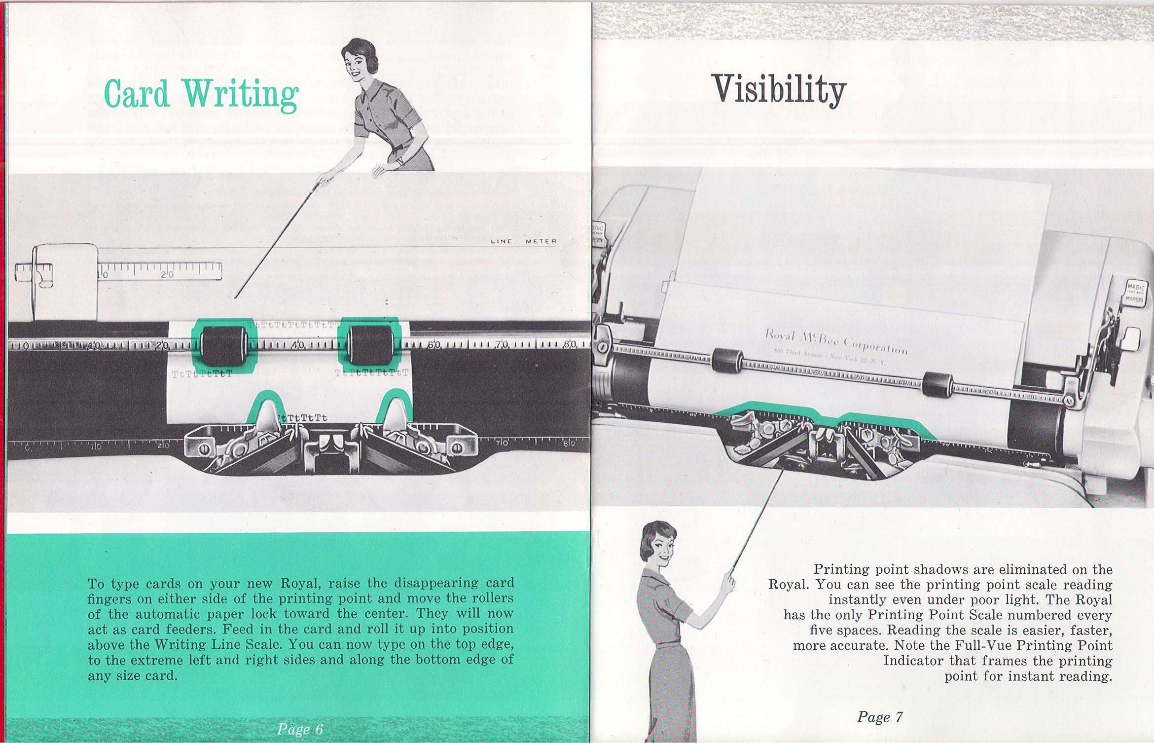
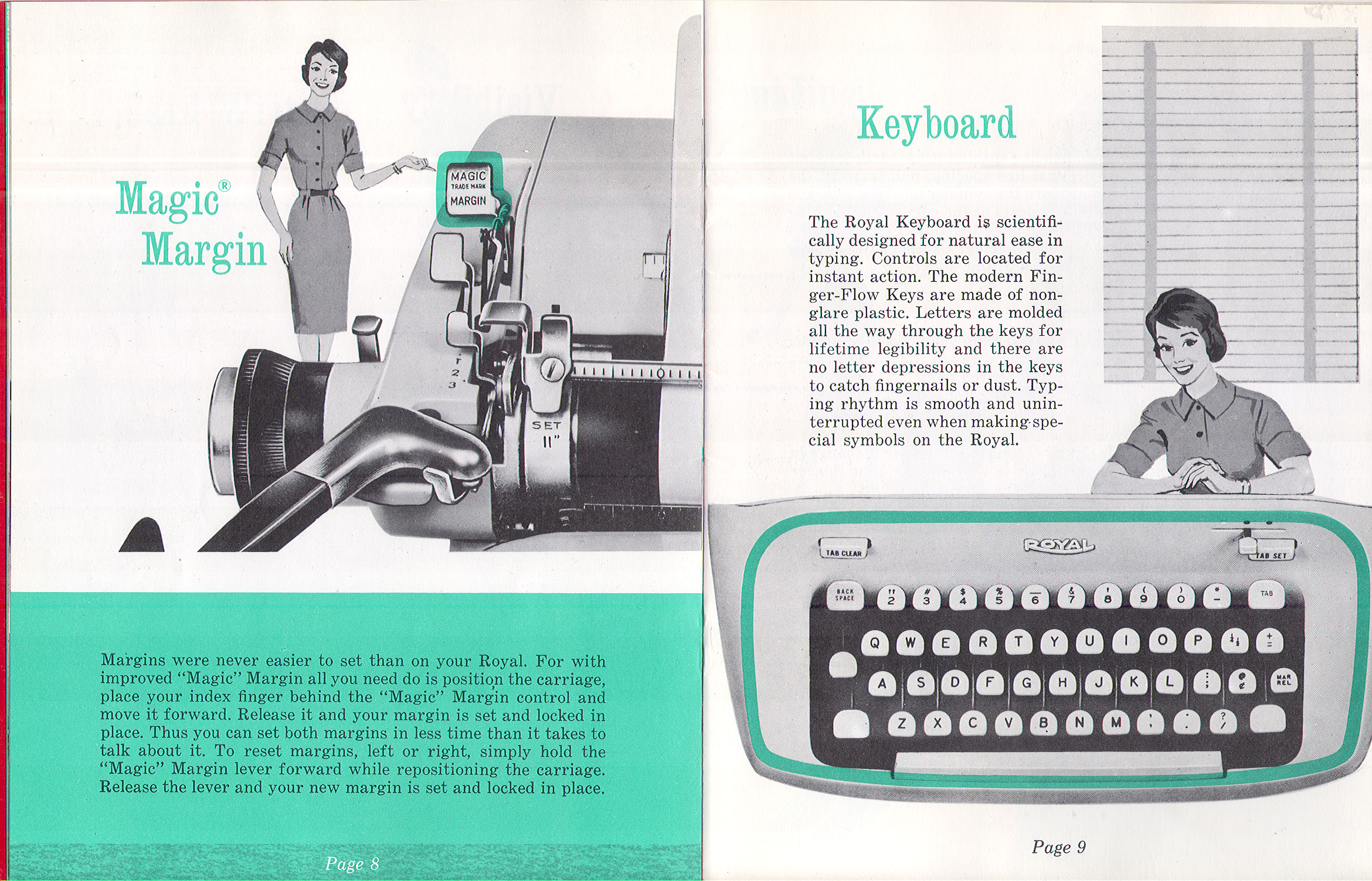
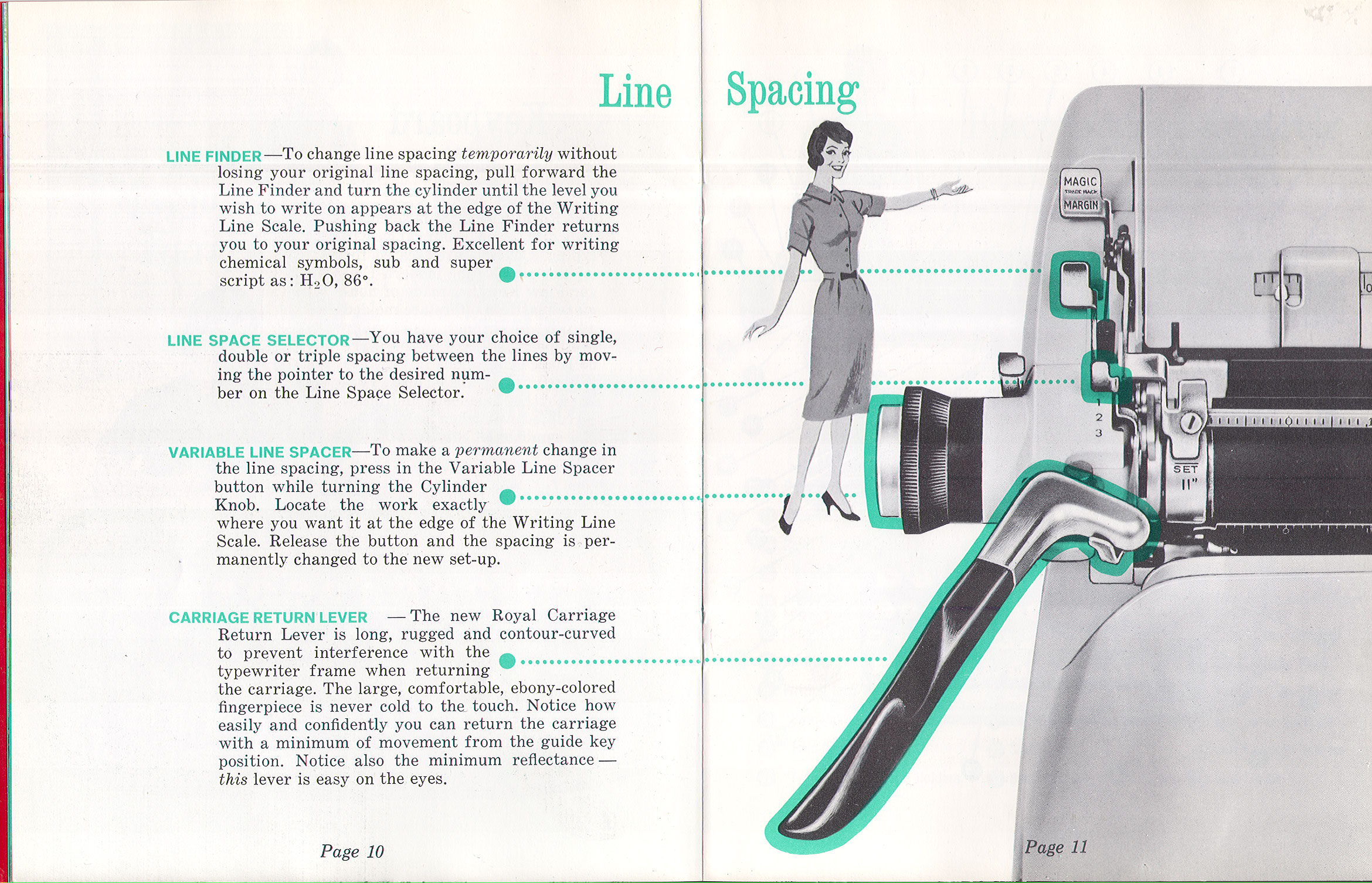
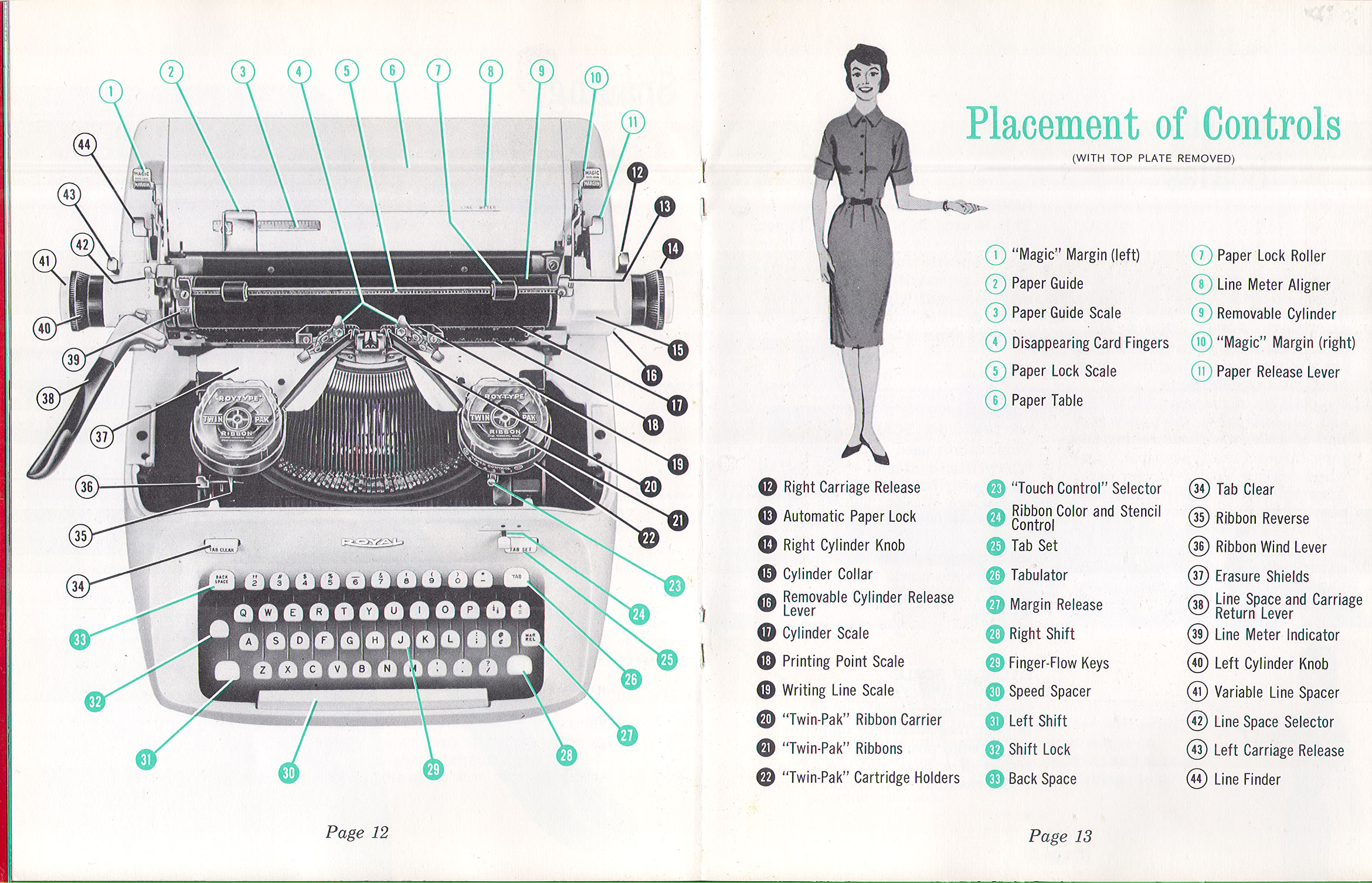
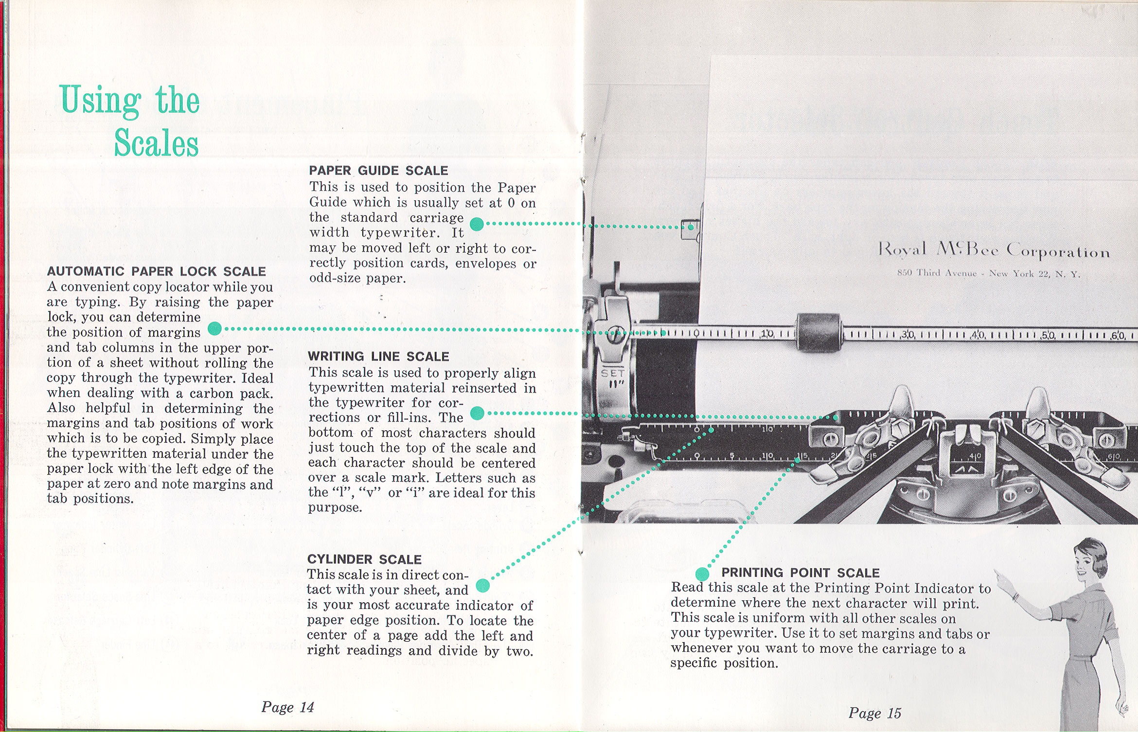
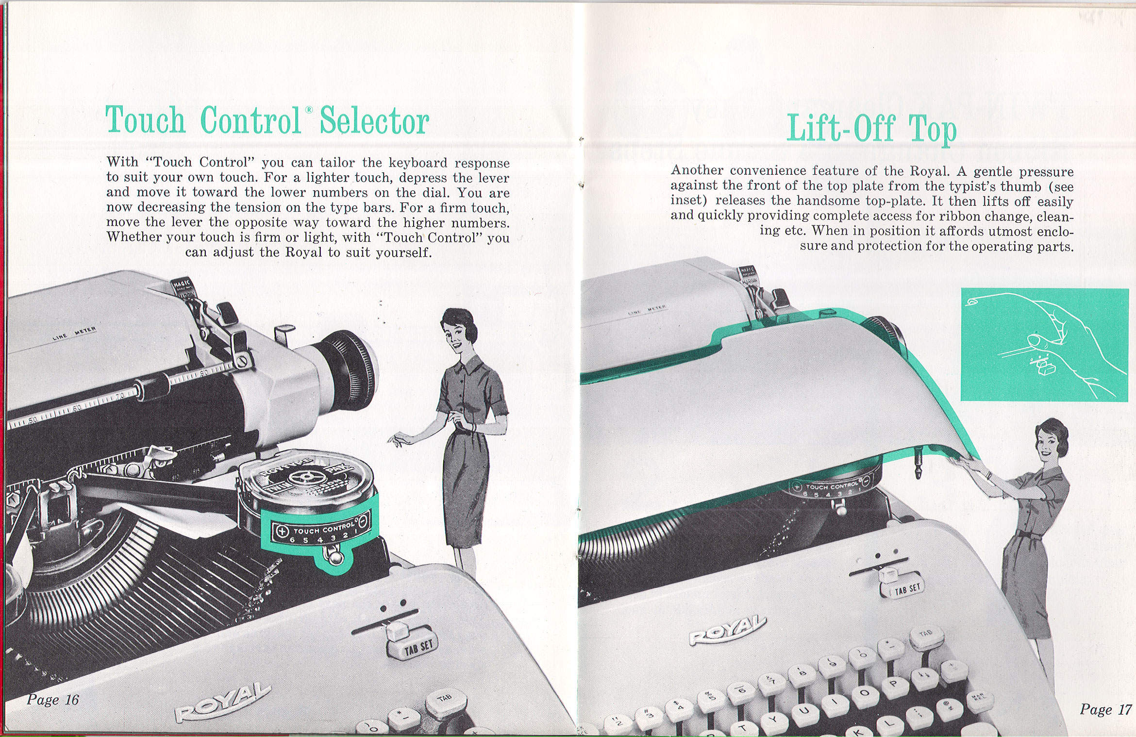
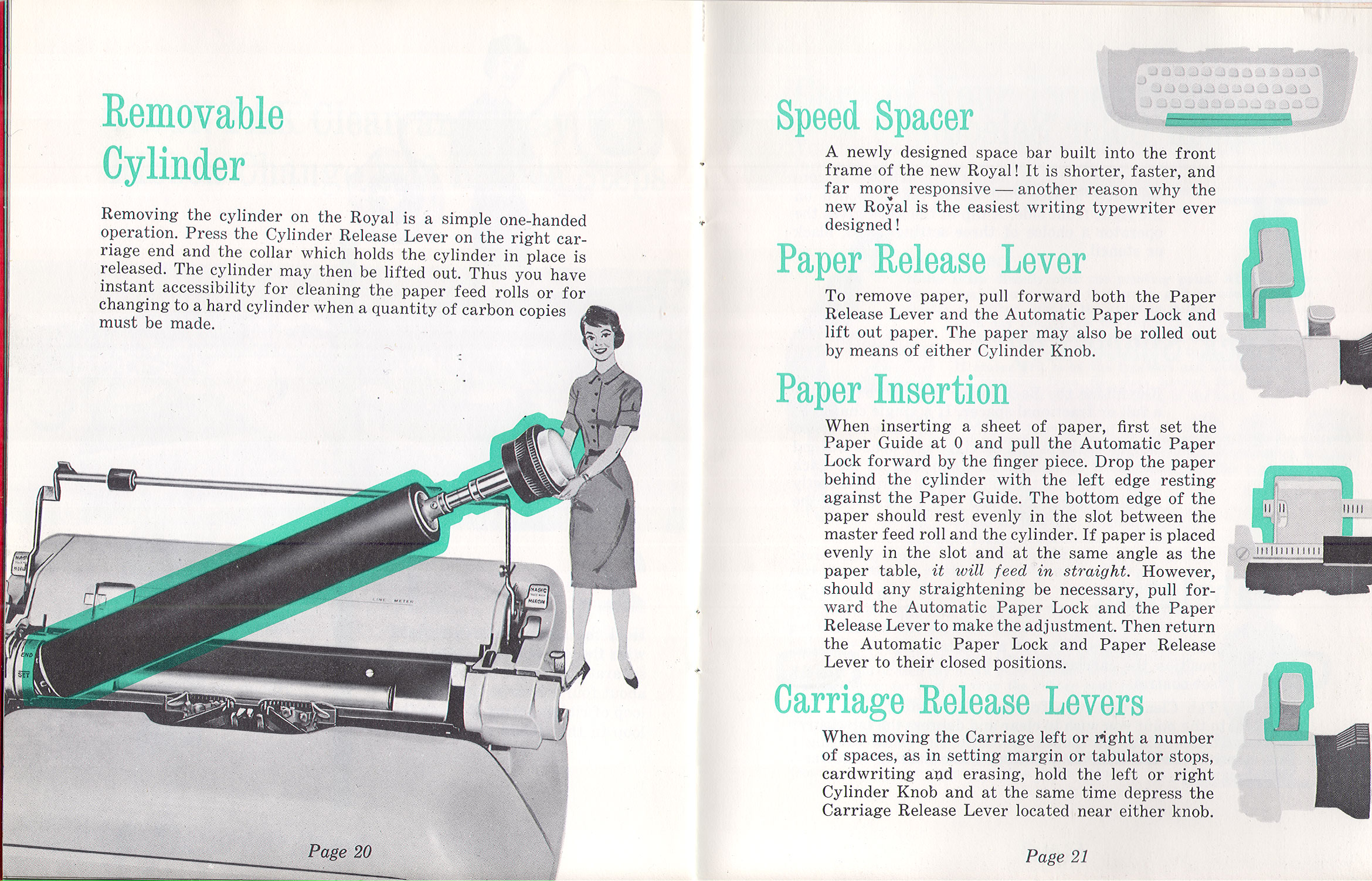
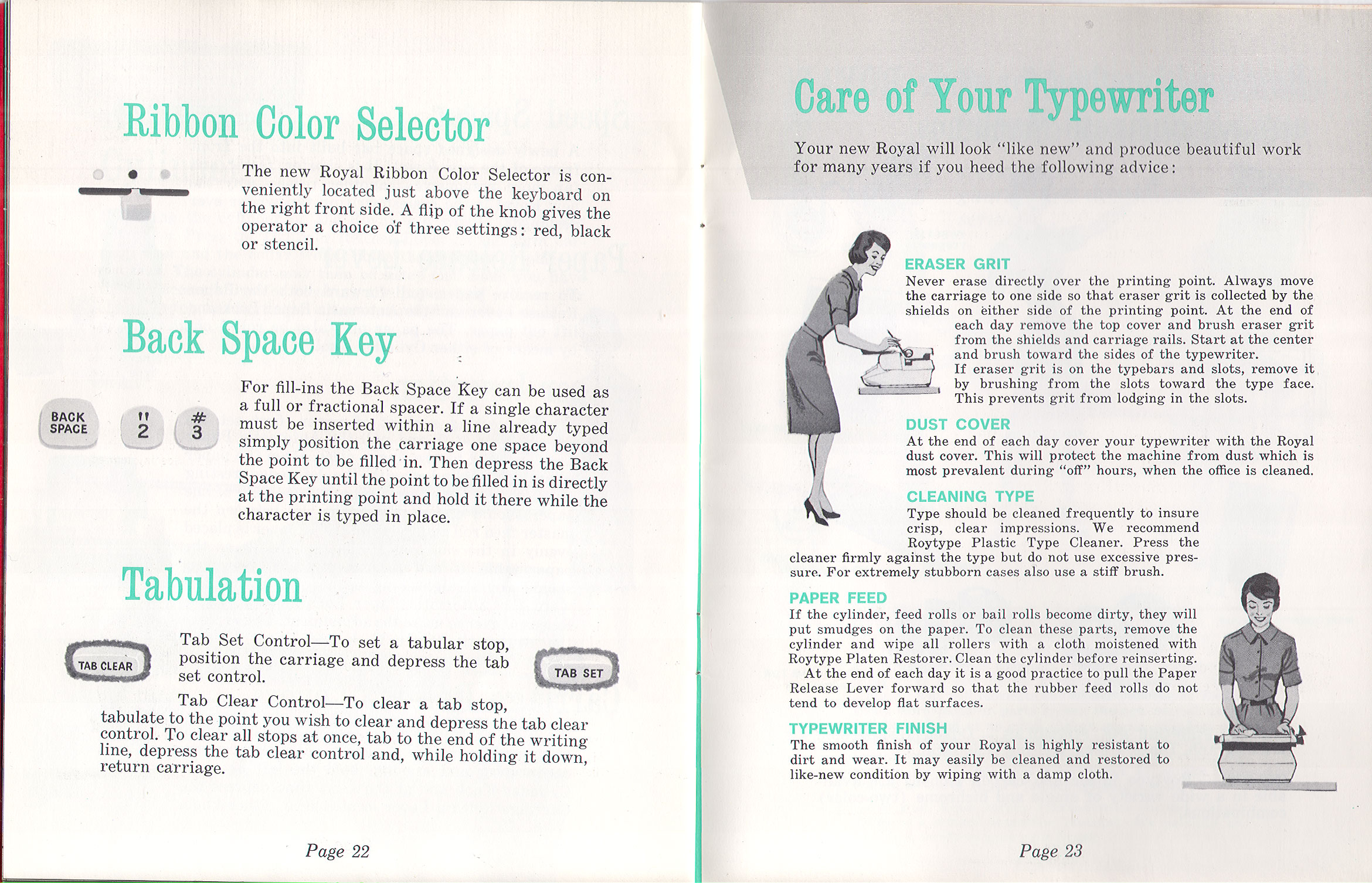
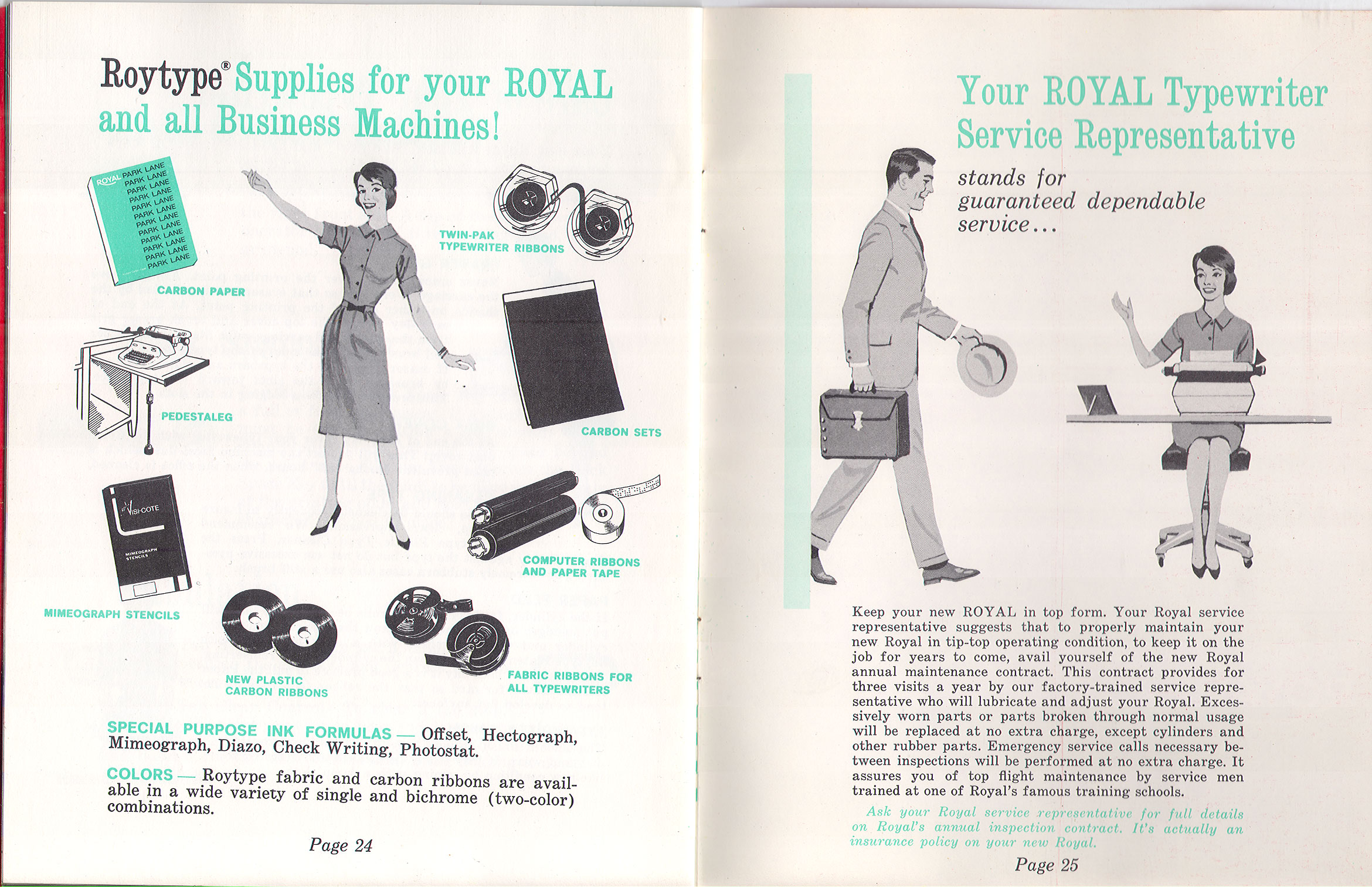
On a personal note, I love this manual because it’s a really fine example of old-school spot color design and printing, which was far cheaper to do back in 1961 than full-color process printing. Nowadays it’s far cheaper to do 4-color than this sort of exacting color knockouts and fill halftones, and you just never see this kind of artistry in manual design anymore. From the Archives of Bill Wahl:



Love your observation about the color printing process; so true. Another fascinating technological skill that’s being forgotten.
== Michael
Here’s another, from a very clean “new old stock” copy I got from Mike Brown.
http://machinesoflovinggrace.com/manuals/RoyalEmpressmanual.pdf
Hey Munk,
Do you know where I can get a pdf repair manual of the Royal 560 electric?
On a side noye: I have one that types 11 characters/inch. So it’s not a pica or an elite machine. Which typeface would this be?
Thank you,
Rob
https://twdb.sellfy.store/p/InEn/
11cpi is not 11cpi, it’s metric. found on machines sold outside the US.